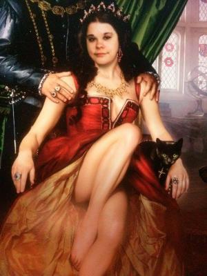
There are some pictures here, the first one was of me last year. I had a perm and I straightened it out to find its true length (and because I was getting tired of the afro it was giving me). I liked it. However, I had cut it off because it was really thick hair and it was reaching summer.
The second one is of my two little ones, R'asha Selene (the grey), and Tsuki Yin (black and white).
R'asha was born May 28th, 2011, but I obtained her September 1st, 2011, and moved around with her quite often since then. She became my baby, and she quite acts like it. I will admit I love the cuddles and massages she gives that I return!
Tsuki was about 10 months old when I received her at the Humane Society in El Paso, TX. We got her in March, so as far as we knew, she was born just around R'asha's time. However, since they didn't know the exact day, we picked her birthday to be that day instead, May 15th. They have both become very good sisters, of course, they had a two-week (minor) illness to bond over!
The third is me back in January 2012, still when I had longer hair, but it was more my natural color at that point, I THINK... anyway, I had glasses and that picture was taken not long before I moved R'asha to El Paso, about two months before Tsuki came along.
The fourth is my first and possibly only ink, which is located on the right side of my right calve. There is quite a bit of symbolism for this piece of art.
1st symbol: to the flesh is not there, because, one symbolization it holds, is that if the heart yearns to be expressed by tattoo the pain is more than worth it. so, the fact the tat is on skin, speaks the words 'to the flesh. This quote means two other things to me. The next, is the general idea that the body goes through nothing in pain compared to what the heart is capable and might go through in life. The last, I will not mention here, but if you ask me I'll most likely tell you.
-2nd symbol: the moon, because i am nocturnal, because i love the moon more than the sun, because i work better with the moon, it gives me more comfort, it is more beautiful, and for me it always humbles me.
-3rd symbol: the third eye symbol, represents my own sensitivity, the fact that i meditate, and, by being there, it is a big part of my life.
-4th symbol: the cat/fox looking head. I love cats, but i also love the fox's supposed intellect as well. The head looks like both and people might take it as they do. It symbolizes my tribute for Bastet as well. The fact that it looks like both, also means duality. There are many things about me that are dual.
-5th symbol: the twisting of the legs underneath the cat/fox is to symbolize eternity as well as the caduceus, as a healer who practices reiki and is going in for alternative medicine, it is very important to me.
-6th symbol: the yinyang... well, it means balance, for everything. I am a neutral being, not good, not evil, but someone who can do both for the sake of humanity.
-7th symbol: the wings, one angel, one demon further states that there are two sides inside, one good, one evil, and i do my best to keep them both happy and in balance.
-8th symbol: chokurei, is the first reiki symbol learned. it is given to put energy into something, and to pull out. As one who is sensitive, this is very useful to have.
-9th symbol: sei hei ki, is the second reiki symbol learned, and it is used essentially for healing intentions.
-10th symbol: it is the feather over the sword symbol, otherwise stating that the pen is mightier than the sword... although, again, i do practice both.
-11th symbol: this third reiki symbol is to help detach a person they are close to from them in order to be unbiased in their healing and dealing with them.. since i love as i will, i only use this for healing purposes.
-12th symbol: the scales of justice. scales equate balance, but it also means that the punishment should always fit the crime, and only then would justice be true. As one who wanted so badly to be in fields that promote justice, I felt it necessary.
-13th symbol: the coloring. Green, symbolizes earth, my element, as i am very grounded, very earthy, very neutral, and, is the color of healing/healers. Blue, because although water isn't my element, it is very calming, and blue is also my favorite color. I also wanted something to remind me of the Islands.
-Finally, the wording on the bottom of the tat: Love is hard, harder than steel and thrice as cruel. It is inexorable as the tides, and life and death alike follow in its wake
-This is to serve as a warning to all who intend to love with all of their being. Love isn't all gumdrops and roses, it can rip one's heart out. the over all effect of the tat serves as warning, because the general graphic portion of the design is a crisscross pattern, with the warning words written on it.
-There is also the fact that the words are from Jacqueline Carey's Kushiel Legacy Series, which has meant a lot to me over the past six years, and helped me fully realize the extent of who and what I am. It is also why this coven is built.
The fifth picture is myself with a very dear friend of mine.
The sixth picture is R'asha, Tsuki, and R'asha's baby (who was born June 11th, this year (2014).
The seventh picture is a drawing of an angel I have done. It's nothing special really, and I am very, very rusty.
The eighth picture is something I did, as an avid lover of the Firefly series, and Serenity movie (browncoat!).
The ninth picture is my cover for my 6th book that I published, Angel Geisha.


