If you are using Chrome, click the red hand button at the top right of the screen:

Then select: Don't run on pages on this site
If you do it correctly, the red hand will turn to green and you will no longer see this message.
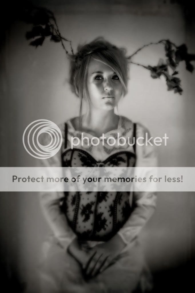
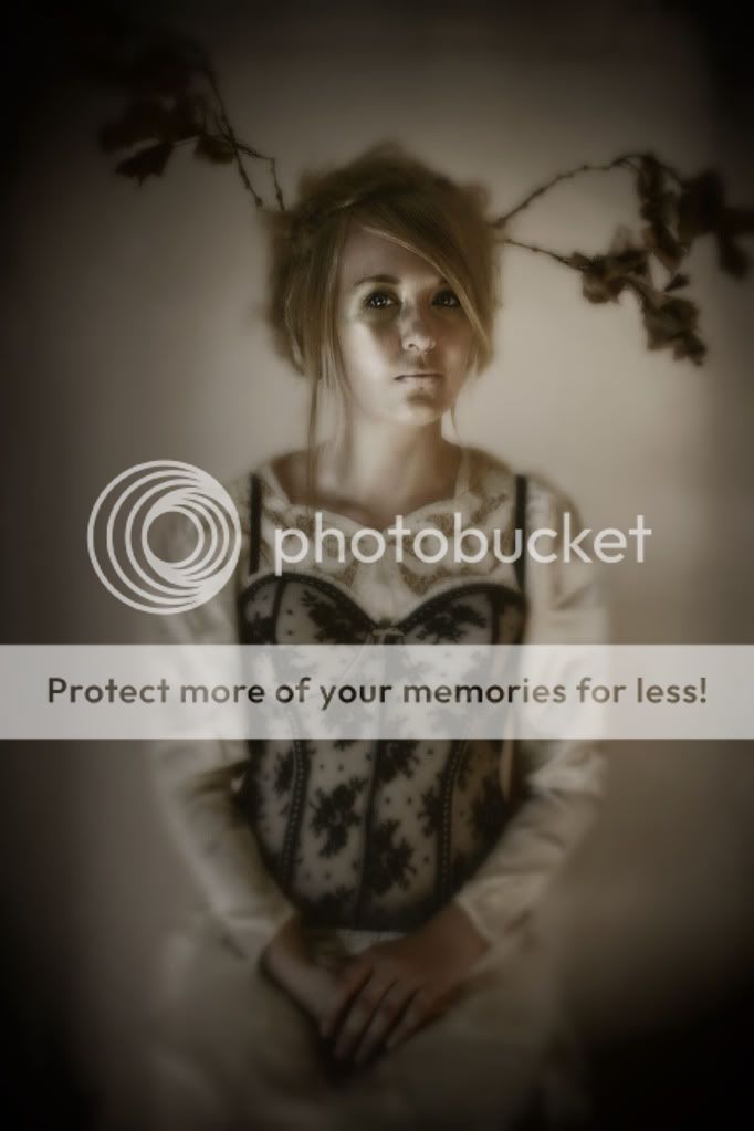
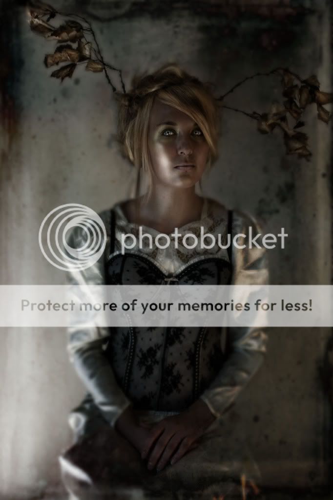
Now, the first version is in the entry below - these are versions 2 & 3 - out of these three, which do you folks like the best? I don't know which I want to use and I am so stuck. I am hoping some other opinions might help me figure this out - so anyone?


COMMENTS
There is an element to this of complete horror... having had a number of encounters with deer, when they are that still they are not calm. So to see this here- a part of me wants to relax into the beauty of it, while another part simply wants to flee before I find out what is holding her transfixed.
I'm mesmerized.
VERY beautiful. Entrancing.
I love the light on her face. :) Wonderful work.
I am getting published again!
It will be my second magazine publishing credit and third publishing credit overall, as the band, Stomp Rocket out of LA is using an image I did for their CD cover. I even got paid for it, if you can imagine that.
Holy damn, this is just getting more and more unbelievable for me.
My benefactor/mentor is flying my youngest and I out to Cleveland at the end of the month, as well. It will be his first plane trip, and our first little vacation together, ever. I am very excited. He is having a reception for the work I assisted him with when he was here in ND, and wants to introduce me to these people who could be beneficial to my work/career.
He is flying me back again, this time alone, in September so I can begin learning the Platinum process of printing. I am so fucking excited to be learning these things, doing these things, and having the opportunity to share this with my loved ones.
Part of me thinks this is luck; another part wants to believe it is my talent - but either way, it is mine, and mine alone and I am fucking thankful.
COMMENTS
This sounds like your break.. that's a result of hard work peppered with good karma :) Well done Anisa, you deserve it!
I second what E said....GO Vespers!!!
Congratulations, lady.
Congratulations, that's awesome. I'm sure you did a hell of a job there. I love your artwork, it's really beautiful.
COMMENTS
-
FiliaOfAbyssus
21:02 Jul 20 2010
I like the first one, in the entry below this. Very beautiful!
WallFlower
21:04 Jul 20 2010
I agree, the first one is the most appealing.
sahahria
21:23 Jul 20 2010
The first has the most depth and texture. So as a stand alone, I like it best. However there are benefits to softer/cleaner looks of the other two- it purely depends on the context of what you are looking to produce.
Morrigon
23:37 Jul 20 2010
To me it seems like color is really important to this image. While the black and white is stunning, when you add in the warm ghostly tones, it really comes to life. I really can't pick out my favorite. I almost wonder what it would look like to have the model appear the same way she does in the entry below, with the background light as it looks in this one.
Vampirewitch39
00:30 Jul 21 2010
As you asked... :)
The one below, the last one in this group, then the black and white last. But know all of them are wonderful.
michen
12:45 Jul 25 2010
I like the one below best as well. It has a strong and well defined edge.